
Hamilton’s Downtown Business Improvement Area is sporting new branding as “DWNTWN Hamilton”. The new brand, unveiled Tuesday evening seeks to refresh the image of “The Core” by focusing on six primary marketing themes: Appetizing (food), Captivating (entertainment), Creative (the arts and creative businesses), Dedicated (service industry and businesses), Genuine, and Professional (services).
All of these themes are tied to the tagline “To The Core” such as “Dedicated To The Core”.
(Ward 2 City Councillor Jason Farr’s tagline is dedicated to the core as well)
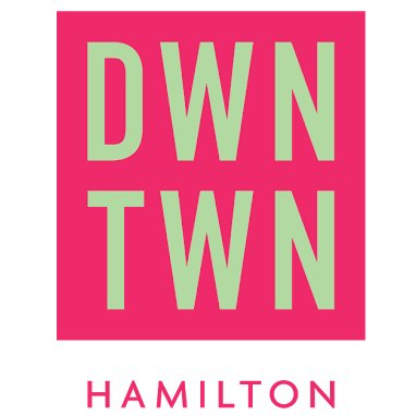
The biggest change is the new text based logo, replacing the Gore Park fountain as the distinctive landmark of the BIA, and the dropping of vowels in the name. The colour palette is interesting to me, mostly because I’ve never seen these two colours put together in a Hamilton logo and it is a sharp departure from the green and blue previously used by the BIA.
![]()
When the BIA last redesigned their brand, Downtown Hamilton had recently seen the rebuilding of the Gore Park fountain and the civic pride of the large fundraising campaign that made that 1996 City of Hamilton sesquicentennial project possible.
The BIA launched a new website with the rebranding on its domain at downtownhamilton.org. Of note on the website is the events calendar page.
It will be interesting to understand the full meaning of the new logo and branding as it is rolled out this summer.
New Downtown BIA Branding